
Deadweight loss due to trade interventions is a very important concept for A level and IB Economics students, as it shows that society is likely to experience a net loss to societal welfare, at least from the perspective of a domestic market diagram.
This is therefore a major point to include in most, if not all essays discussing the overall merits of trade interventions, since import tariffs and quotas tend to be the go-to interventions suggested by students.
Free Trade
We begin first by illustrating how free trade results in a market price and quantity for the domestic market. The international supply is assumed to be extremely competitive, such that it is perfectly price elastic at P0.
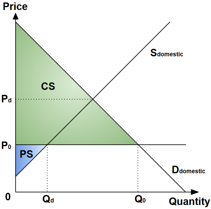
In markets where domestic producers are less competitive relative to foreign producers, the autarky price (i.e. market price with zero trade) Pd is higher than P0.
For each given quantity level, consumers are assumed to choose whether to purchase the domestic produce, or import from foreign producers by picking whichever offers the lower price. Therefore until quantity Qd, consumers will consume domestically as the domestic price is lower than the international price of P0.
However, past Qd, consumers will begin importing foreign produce since the domestic price exceeds P0. The total consumption of Q0 is then determined by the intersection of the domestic demand and P0 which represents the foreign supply. The imported quantity is equivalent to Q0-Qd.
The total social welfare under free trade condition is thus maximised at the current sum of the consumers’ surplus (green area) and the producers’ surplus (blue area).
Import Tariffs
A tariff amount of T, per-unit quantity, is applied to the imported goods, increasing the price from P0 to P0+T. Welfare loss is experienced by consumers as they experience a higher price, and reduced consumption quantity. The reduction to the consumers’ surplus is represented in the diagram below as area A+ B+C+D:

Does area A+B+C+D represent the total social welfare loss? We can attempt to account for the movements to the respective sub-areas:
Area A: Gain to producers’ welfare.
Domestic producers gain market share at the expense of foreign importers with the tariff making the latter less price-competitive, increasing the output from Qd to Qd‘. Area A is therefore welfare transferred from consumers to producers, rather than lost from society.
Area C: Tariff revenue.
The foreign imports are reduced from Q0-Qd to Q0‘-Qd‘, and subject to the tariff rate payable per unit quantity to the domestic government, at T. The total tariff paid to the government is then T(Q0‘-Qd‘), corresponding to area C. Since the tariff revenue accrues to the government budget, which is assumed to be spent domestically later, area C is welfare transferred from consumers to society as a whole, rather than lost from society.
Areas B and D: Deadweight loss.
Unlike areas A and C, areas B and D have no obvious transfer recipients. Therefore the loss in consumers’ surplus here represents social welfare loss, and therefore deadweight loss. The combined loss respresents the welfare loss to consumers (and society) caused by the higher price and lower consumption quantity.
Import Quotas
In this case, an arbitrary limit of Qm is applied to the imported goods and domestic producers increase output to close the shortage. Foreign imports are therefore reduced from Q0-Qd to Qm-Qd, and the domestic supply resumes past the quota limit of Qm as illustrated by Sdomestic‘. The new domestic market equilibrium is therefore at a lower quantity of Q0‘ and a higher price of Pm:
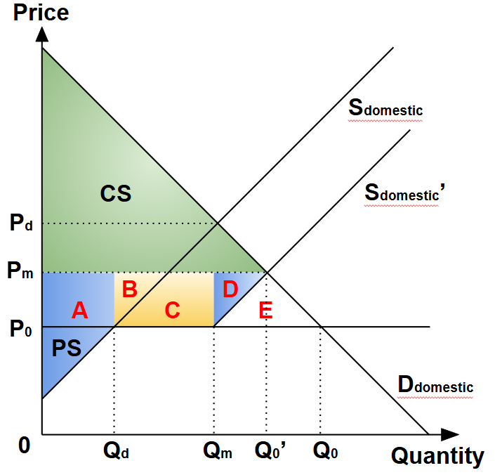
Similar to the case of the import tariff, the consumers’ surplus is reduced by the area A+B+C+D+E+F, and we can determine the societal deadweight loss by tracing any transfers of welfare to the producers or the government.
Area A: Gain to domestic producers’ welfare.
Domestic producers gain producers’ surplus on the back of the increase in price from P0 to Pm on the original domestic output of Qd.
Area B and C: Gain to foreign producers’ welfare.
Similarly, foreign producers gain this surplus due to the increase in price from P0 to Pm on the quota-limited import quantity of Qm-Qd. However, this is considered to be a welfare loss from the domestic society’s perspective, since the gain is accrued to foreign producers, and is typically counted to deadweight loss.
Area D: Gain to domestic producers’ welfare.
Domestic producers gain additional output of Q0‘-Qm at the expense of foreign producers, resulting in a gain to producers’ surplus amounting to area D.
Areas E: Deadweight loss.
Unlike areas A, B, C and D, area E has no obvious transfer recipients. Therefore the loss in consumers’ surplus here contributes to social welfare loss, and therefore deadweight loss, respresenting the welfare loss to consumers (and society) caused by the higher price and lower consumption quantity.
As a recap, areas B and C are counted also to the deadweight loss too since these welfares were lost to foreign producers. In addition, area D is geometrically similar to area B due to the Parallelogram Law.
Taken together, the most common diagramatic depiction of deadweight loss is to show area A as the gain to producers’ surplus, and area C+D as the deadweight loss:

Update (2026): The team at JC Econs 101 has collaborated with DeadWeight·Plots to produce a step-by-step animations of the diagrams discussed:
Be sure to check them out!
