
One of my favourite ways to look like a savant, is to show off my ability to remember the definitions of the 2 most important National Income statistics that students taking “A” levels must know: GDP and GNI.
The GDP, or Gross Domestic Product, of a country, refers to the total money value of all goods and services produced with its physical boundaries, for a given time period.
And the GNI, or Gross National Income, of a country, refers to the total money value of all goods and services produced by its citizens, regardless of their place of residence globally, for a given time period.
Truth to be said, this is more the result of me having to repeat myself for more than a decade, than me being extraordinarily learned. So it isn’t much to shout about really.
Global GNI and GDP.
It so happened last week, on yet another such occasion with my student, that I spontaneously decided to turn to Google, to illustrate that as there are countries whose GNI > GDP, there will be others whose GNI < GDP.
The easiest way to see why, is to recognise first, that GNI and GDP are related by the following identity:
GNI = GDP + Net Income from Abroad
If we constrain our world into 2 countries, Country 1 and Country 2, then if Country 1 experiences a net income inflow, then Country 2’s income outflow must exist in equivalent magnitude.
If the magnitude of net income flow from each country is represented by X, then we can derive the global GNI as:
GNI1 + GNI2 = ( GDP1 + X ) + ( GDP2 – X )
GNI1 + GNI2 = GDP1 + GDP2
And therefore, we can generalise our above example, to conclude that at the global level, GDP must equal GNI. Intuitively, this is because physical boundaries between countries. or the respective citizenships, do not matter in calculating global output levels.

Things didn’t quite add up?
All that said, has been the theory. How does that add up in real-life?
So back to my story about last week’s lesson, my attempts at showing at least a semblance of equal probability in illustrating countries exhibiting either GNI > GDP, or GNI < GDP, was best described as almost an abject failure.
For some reason, the countries that I selected at random, were more likely than not, to exhibit the latter case (net income outflow).
Since we established that the global sum for income outflows must equal income inflows, and leaving aside the possibility of dumb poor luck, the most plausible explanation would be that of bias. After all, I am only human, and will tend to select countries based on what happened to be most accessible to my mind at that point (usually Asia).
The logical correction to this, is to look for as comprehensive a set of data online, as possible, to try and suss out what I needed. And it happened that the World Bank’s data-set was (very) good-enough indeed for my purpose.
Of course, things didn’t go to plan again. I selected the data for 2019, and promptly discovered that the reported global GDP and GNI, in PPP $ terms, weren’t the same.
Like what?

At face value, we could explain the apparent discrepancy with the World Bank’s data-collection methodology of taking each data-point “naively” from those reported by the respective countries, each with their own data collection, interpretation and valuation system.
Therefore the most obvious consequence of errors resulting from these differences, would show up as the failure to reconcile the sum of net income flows across the world, which should have been $0 in theory.
Poring over the data in greater detail revealed also that data wasn’t available for some countries such as Andorra, Eritea and North Korea. What more the talk of absolute reconciliation?
Astute readers should also be able to observe that whilst $670B sounded like an awful lot of discrepancy, it actually represented only 0.5% of global GNI. For most purposes, that should indeed be good enough to show that the net income inflows and net income outflows globally do match.
The net income outflow champions.
It follows therefore that we should be able to find countries with net income flows of interest to us (i.e. unusually large ones), for the sake of it.
Starting first with net income outflows, looking at our top 10 contenders, we have:
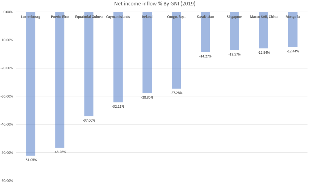
The case for Singapore (ranked 8), wasn’t a surprise to me, since we know this is because of the high proportion of foreign companies setting up shop in Singapore, and the large population of foreign labour, sending monies back home. Still, seeing how high it was ranked gave me some pause for thought.
At risk of glossing over potentially juicy details, the same explanation can more or less describe the context for the other countries/territories.
One in particular, deserved special mention: The Cayman Islands. If that didn’t ring a bell already, the Cayman Islands is a very well-known (notorious) tax haven with no direct tax, such as income and corporate tax – at all.
Little wonder then, that many companies and individuals have set-up shop in the Cayman Islands, bringing with them obscene amounts of money. These show up as net income outflows, as the monies do not belong to citizens of the Cayman Islands.
Just how much of a tax haven is the Cayman Islands?
Considering that former US President Barack Obama once labelled it as “biggest tax scam on record“, and unofficial estimates of the number of corporations registered in the Cayman Islands was twice as high as the number of residents, it appears to be very much so, despite its “attempts” to avoid such a label.
The net income inflow champions.
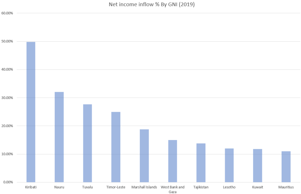
Intriguingly, 4 of the top 5 on our list are Pacific Island nations. And their claim to fame lies in large outward labour flows to other countries, especially to Australia, and resulting remittance.
A high GNI relative to GDP doesn’t always point to large labour outflows only though. Cross-border aid sent or received, are recorded accordingly as income flows between countries. This is the unfortunate cases of Timor-Leste and the Palestinian Territories of West Bank and Gaza.
The former’s economic infrastructure was all but destroyed and yet to fully recover from its separation blood-bath with Indonesia, and the latter’s economic activities are heavily stunted by Israeli pressure, and therefore dependent on foreign aid.
Final word.
Lest you come away with the impression of large imbalances between GNI and GDP being the norm in our earlier exercise, in fact, the majority of countries have somewhat equal-sized GDP and GNI.
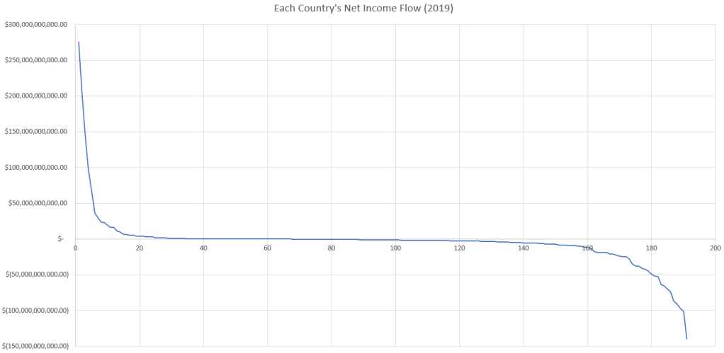
Intriguingly, there is another key observation worth highlighting.
Referring to the graph above, the distribution of countries with net income inflow appears to be significantly smaller than that of countries with net income outflows. Naturally, since the net flows across the world must (almost) cancel out, the peak net income inflow is also much higher than the peak net income outflow.
The key implication to this is that firms and/or workers from a few countries must have disproportionately large interactions with other parts of the world by comparison. By order of net income inflow size, the largest were from: USA, Japan, Germany, Philippines, France.
Is there more than meets the eye, from these superficial observations? Perhaps more about that in the next one.


fantastic points altogether, you simply received a new reader.What would you suggest about your put up that you just made some days in the past?Any sure?
LikeLike
Beneficial write ups. Cheers!pay for college essays essay writer help with english writing
LikeLike
Among the very best blogs with a subject I have a great deal of interest in.
LikeLike